The Evolution of the ATHENA® Logo
Every great story has its pivotal chapters, and at ATHENA®, our journey is visually chronicled in the evolution of our logo. More than just a brand mark, our symbol is a visual diary that has grown and transformed alongside us. From a literal depiction of a beloved landmark to the sophisticated symbol we carry today, this is the story of how our identity was forged.
Chapter 1: The Lightning Tree – A Symbol of Resilience

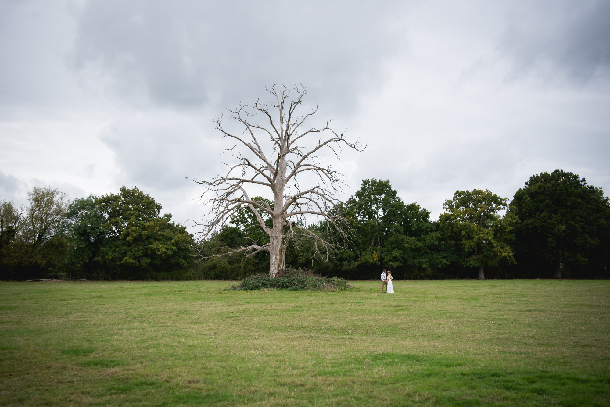
Our story begins with the land itself and a silent sentinel that has watched over it for generations: an old, lightning-struck tree. When our founders, Jennifer and Brent, began their journey here, this tree became a powerful symbol of resilience, history, and a deep, unshakable connection to the earth.
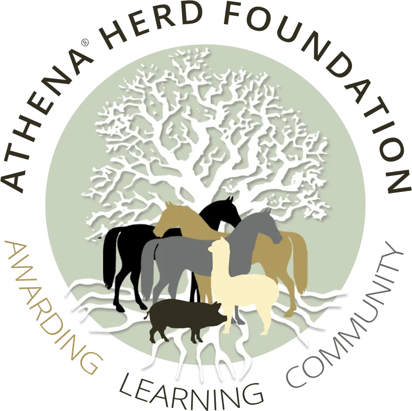
It was this very tree that inspired our first logo, expertly crafted by Kate Chandler.
This original mark captured the foundational spirit of ATHENA®. The white, resilient tree stood at the center, its roots and branches cradling the herd of horses and animals we sought to protect. The entire scene was encompassed by a circle, representing the safe, whole, and nurturing community we were building. This logo was our anchor—a declaration of our roots and our commitment to providing a sanctuary grounded in nature.
