Our Story in a Symbol
From a Beloved Landmark to a Global Symbol of Well-being. This is the visual history of ATHENA®, a story of growth and transformation told through the evolution of our logo.

From a Beloved Landmark to a Global Symbol of Well-being. This is the visual history of ATHENA®, a story of growth and transformation told through the evolution of our logo.
Every great story has its pivotal chapters, and at the ATHENA® Herd Foundation, our journey is visually chronicled in the evolution of our logo. More than just a brand mark, our symbol is a visual diary that has grown and transformed alongside us. From a literal depiction of a beloved landmark to the sophisticated symbol we carry today, this is the story of how our identity was forged.
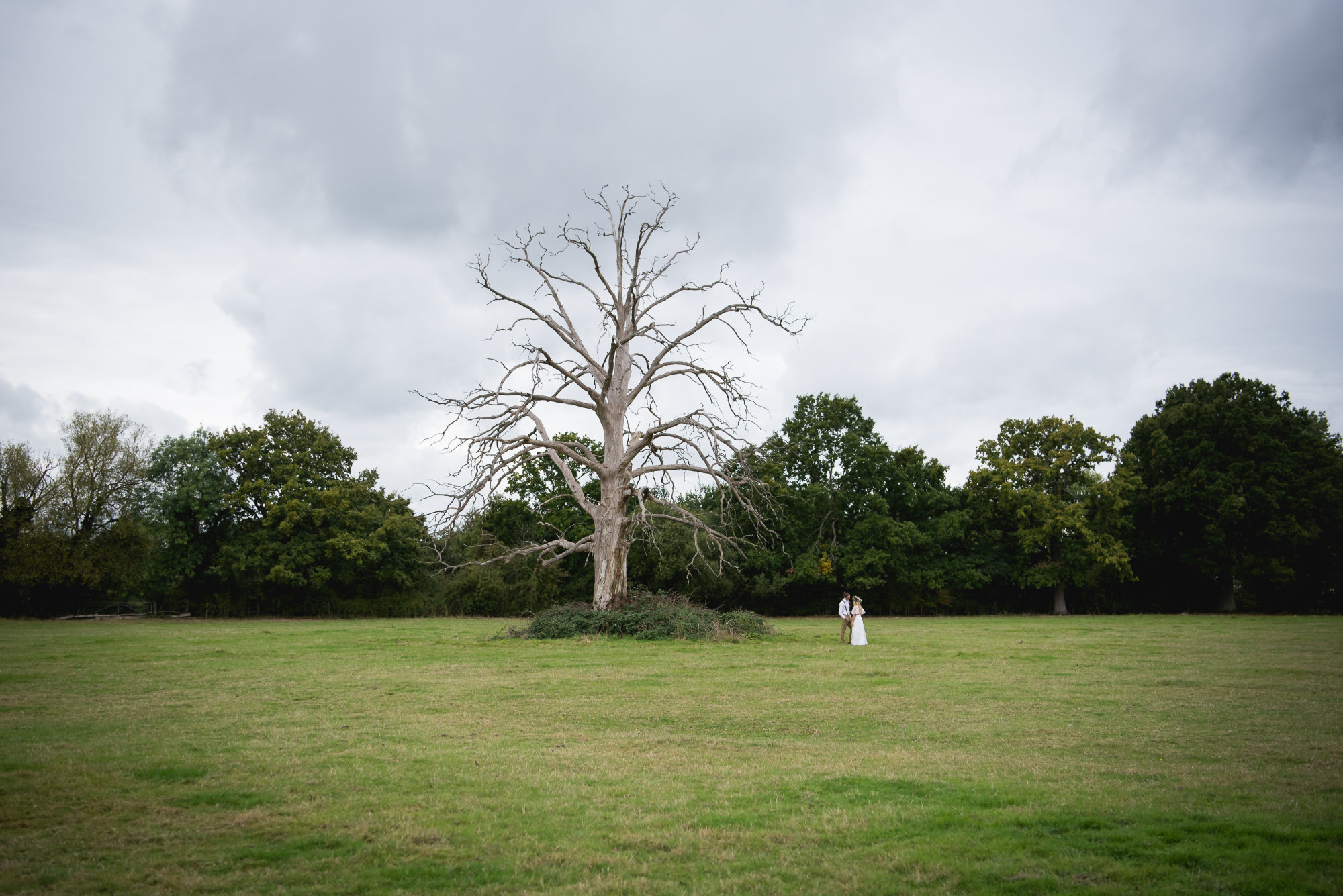
Our story begins with the land itself and a silent sentinel that has watched over it for generations: an old, lightning-struck tree. When our founders, Jennifer and Brent, began their journey here, this tree became a powerful symbol of resilience, history, and a deep, unshakable connection to the earth.
It was this very tree that inspired our first logo, expertly crafted by Kate Chandler.
This original mark captured the foundational spirit of ATHENA®. The white, resilient tree stood at the center, its roots and branches cradling the herd of horses and animals we sought to protect. The entire scene was encompassed by a circle, representing the safe, whole, and nurturing community we were building. This logo was our anchor—a declaration of our roots and our commitment to providing a sanctuary grounded in nature.
As the Athena Herd Foundation grew, our work became more defined. Our mission solidified into three core pillars: Awarding professional standards, providing accredited Learning, and fostering a deep sense of Community. We needed a logo that could represent this living, breathing system.
This led to our next evolution, a thoughtful adaptation designed by Frankie.
In this version, the tree transforms from a static symbol of resilience into a vibrant, living entity. Its very structure tells the story of our work: the strong roots ground us in Community and nourish our Learning programs, while the sturdy trunk rises to support our Awarding arm. The herd remains sheltered by its branches, still at the heart of our mission. This logo perfectly represented a period of dynamic growth, formalising our structure while staying true to our organic, nature-based philosophy.
Today, ATHENA® has blossomed into an internationally recognised leader in well-being and equine-facilitated interactions. Our journey called for a new symbol—one that distills our rich history into a clean, elegant, and instantly recognisable mark that could represent us on a global stage.
This is the logo we carry proudly today.
This final evolution is a masterful blend of symbolism and sophistication. The literal tree and herd have transformed into the elegant, golden letter 'A', for Athena. It speaks of the wisdom and quality inherent in our work. The spirit of the Lightning Tree lives on in the green leaves and vines gracefully entwined with the 'A', representing our "back to basics" philosophy and the life-giving power of nature.
Below this powerful symbol, our three pillars - Awarding | Learning | Community - are stated with clarity and confidence.
From a real tree to a living system to a sophisticated global symbol, the evolution of our logo mirrors our own. It is a constant reminder that while we continue to grow and reach for the future, we will always be nourished by the deep roots of our story.